

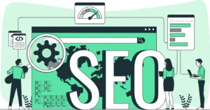
Google’s impending Mobile-First update will rank websites by mobile experience first (rather than desktop) which could have a negative impact on websites without a responsive web design.
More people than ever are now using their phones to browse the internet, and Google wants to offer its users high quality search results. To do this it favours websites that display and function well on mobile devices.
Whilst Google favoured these responsive websites for some time now, their latest update will give even greater preference to mobile-friendly websites in the search engine ranking.
What is a responsive website design?
A responsive design means the website adapts to fit the size of any given screen.
When a website is responsive, it will look good and function well whether you view it on a desktop computer, tablet or mobile phone.
This is achieved by changing the layout and content according to the screen size the website is being viewed on.
Responsive design should not be confused with having a mobile version of your website. We will look more closely at the difference between the two later in this blog entry.
Why is responsive website design so important?
A responsive design will greatly improve functionality, design and user-experience on your website, making it easier for you to make a good impression, keep visitors on your website for longer and convert them into paying customers or enquiries.
With mobile browsing overtaking desktop browsing back in 2016, a website that doesn’t have a responsive design is likely to cause a huge portion of its traffic to hit the back button on their browser pretty swiftly.
Websites that don’t adapt to different-sized screens can cause visitors a real headache. A non-responsive website usually has major functionality problems when viewed on a phone, making it impossible for visitors to navigate around the website or view information. A few problems they might encounter include images or text cut off the screen, text is too small to read or navigation buttons impossible to reach.
What is the Google Mobile-First update?
Simply put, Google’s Mobile-First update will mean that, instead of primarily looking at the desktop version of a website when evaluating its content, Google will now evaluate at the mobile version first.
Who will it impact? Responsive design vs mobile and desktop sites
Some websites have a mobile version and yet are not responsive. You can usually tell whether a website is responsive or not by checking the URL. If the website adapts to different screen sizes and the URL remains the same across all devices then the website is usually responsive.
If the website looks different across different devices but has a different URL on a mobile to say a desktop, then you are probably viewing a mobile version of the website rather than looking at a website with a responsive design.
Websites with responsive designs generally contain the same content throughout, it is just displayed differently on different devices, these websites are unlikely to see a change in ranking due to the new update.
However, websites with separate desktop and mobile versions often have differing content on each version. These are the websites that may see the biggest impact on their rankings after Google’s update. This is because if their mobile version contains less content than their desktop version they could be deemed to be a less valuable source than they were before.
How can I prepare for Google’s update?
Google is vague about when to expect this update to be widely rolled out. We are, however, expecting it some time in the first quarter of 2018.
If your website isn’t yet responsive then now is the time to act! Well, technically yesterday was the time to act… but failing that, now is a great time too!
Getting a responsive website design won’t just help you to get into Google’s good books, it’ll also provide a customer experience that consistently functions well and looks great.
In short, a responsive website design will make it easy for your customers to make an enquiry or spend their money on your website, so what’s not to love?


